Interview: Kid Styles (Masta Ace – Sittin’ On Chrome)
Even though classic hip hop music will often speak for itself, there is a lot to be said for its many accompanying elements. Music videos, press shots and album artwork all serve to solidify and intensify the messages, sounds and aesthetic of a record, and can also enhance and further the hip hop movement as a whole.
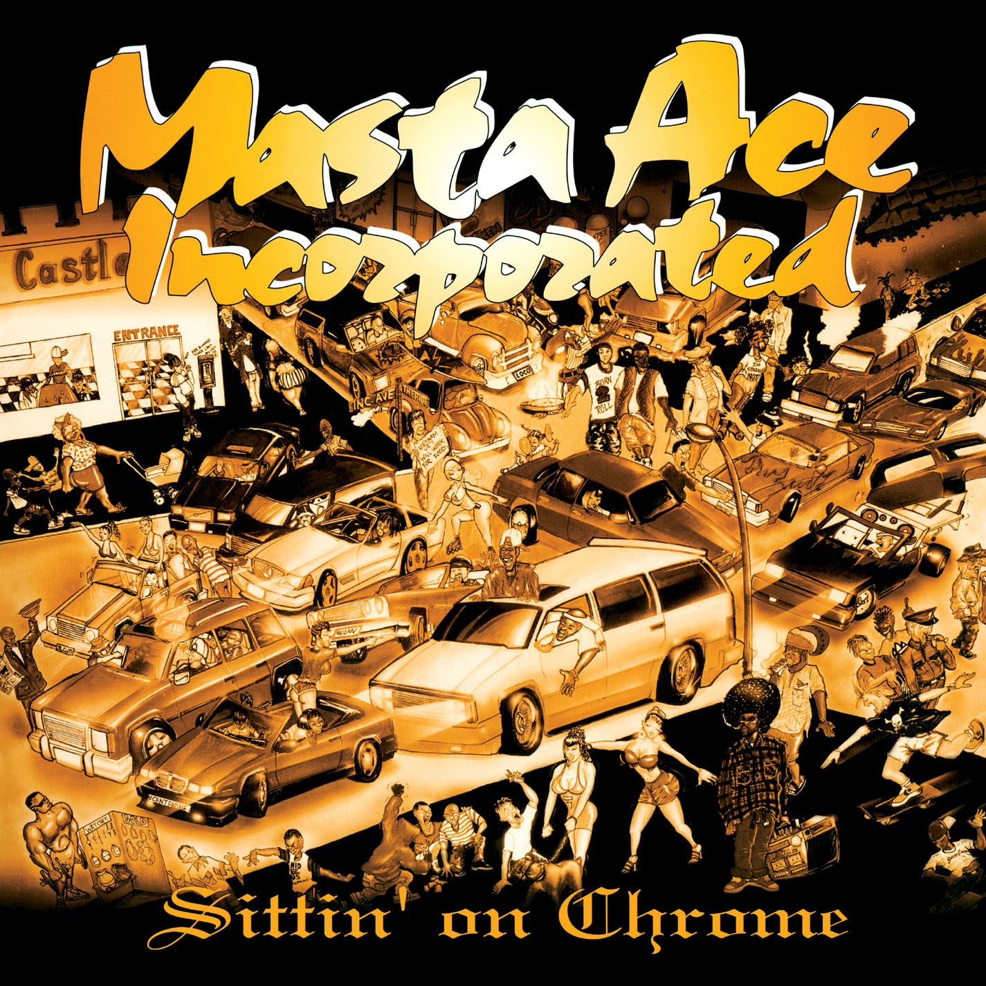
One particularly iconic hip hop album cover is that of Masta Ace’s 1995 release Sittin’ on Chrome with Masta Ace Incorporated on Delicious Vinyl. The gilded cover boasts an intensely detailed cartoon scene; a collision of street characters and happenings on the corner of ‘INC’ and ‘Ride’. The image depicts a metaphorical cross-section of East and West coast sights, reflecting Ace’s own dealings with, and observations of, the cities of New York and Los Angeles.
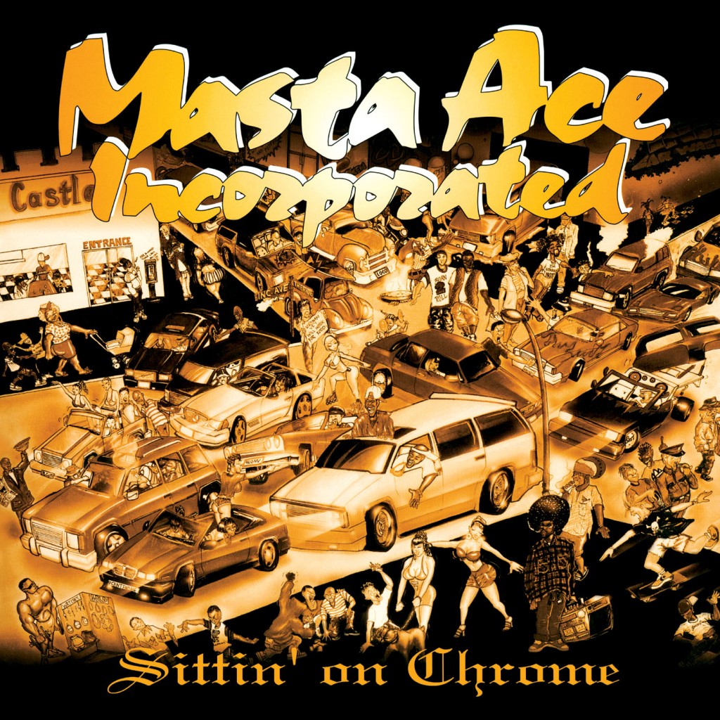
Ace’s own vision for the cover was made a reality by the handiwork of Texan artist Kid Styles. After I tracked my fellow Styles down, he was game to have a little chat about the Sittin’ on Chrome artwork (above), and to reminisce about the time of its creation:
How did you get approached to do the cover? How did the collaboration come about?
Masta Ace was performing at a club in Houston Texas, way back when, and I was there checking him out because he was one of the artists that I always liked. I always have my artwork with me, I do a lot of illustration and things like that, and I went to the club and went to talk with him. I showed him some of my work and he immediately was like ‘oh you would be perfect for an upcoming album cover that I have in mind…’ And in exactly a week he gave me a call, like he said he would, and he had contacted his record label Delicious Vinyl in Los Angeles. We had a big conference call and it went from there in terms of what was needed to get me to work on the design as well as get me there, working in collaboration on a design.
Were you set a brief for the design? How much freedom were you given? Did Ace have a specific vision for what he wanted?
The whole design process for the cover was really nice. First they asked if I had time to fly to New York whilst he made the album. So, they flew me to New York and once I got there I went straight to the studio and was able to be there in the studio with them. It was a great honour to be there during the process while he made the actual album. I listened to the music and I vibed with them, and talked with them about the concept.
We both wanted to make sure we put a good vision on representing the LA elements and some of the New York elements that you might see in there. Ace said that he wanted the intersection to portray a lot of the things that you might see being in New York and at the same time reflect that his record label was based in Los Angeles. So we sat together while he was at the studio and put it together, we jotted down all kinds of ideas of what we might need and things like that, and after that it really worked out nice.
I flew back to Houston and started drawing, and once I got it all together, I mailed it off to LA. I called to see if they got it and when I called they said they were all about the cover. They said it was really dope and that they loved it and Masta Ace loved it too.
I mean, I really enjoyed doing that cover.
So with it being the intersection on the cover of the album, there is a double meaning of it being the intersection of East meets West, is that right?
Exactly. I think that was one of the main things that he wanted to portray on the cover, reflecting how he was in New York but at the same time deals with LA. Showing some of the things that they do there or you might see in LA as oppose to in New York; the people, the way they dress or the things you might actually see them in the street doing.
The intersection on the cover – is it inspired by any particular real-life spot? Or is it a completely fictitious street? It says it’s the corner of ‘INC’ and ‘Ride’…
Yes it’s fictitious. But, there are some real things in there that might be in LA or New York. So once we jotted those elements down, we made the intersection and just made it work.
How much license would you say you took depicting those street scenes? There’s one car with a really DIY sound-system – was a lot of that very exaggerated? Or would you kind of see stuff like that, on that level, back then?
(laughs) Yeah, it was a lot of exaggeration. Though at the same time it was pretty much on point of as far as what you might see, but I definitely wanted to be on the cartoonish level of putting the illustration together, putting more comical elements in there.
Some of the scenarios in it are very similar to the content of Masta Ace’s lyrics and the content of his music videos – the youths and the police, and the women on the street corners – was it a conscious thing that you wanted to mirror the content of the album, or was it more of a natural process that the two were the same?
It was natural; I really had the great chance to be with him and vibe with them physically while they were in the studio making the album. So being an artist and an illustrator I kind of absorbed his lyrics and made it more visual.
There are two characters quite central in the design – are they supposed to be Masta Ace and maybe Lord Digga? There’s the guy in the Born2Roll t-shirt…
Oh yeah (laughs). Man – yeah, that’s right! That was definitely something that we went over and might have put in some special little things in there that he might have requested. I’ve had several people who there are a lot of things that they haven’t seen, and they’ll stare at the cover for a long time and they’ll see the little images after a while. Some people say they’ve owned the album for a long time, but didn’t really pay attention to those smaller details.
Yeah, there’s the guy coming up from the sewer crate – reminds me of all the stuff I had as a kid like ‘Where’s Waldo?’
Oh that! ’Where’s Waldo?’ With the little hat on, I remember that. It was almost similar to that, exactly (laughs).
‘Where’s Ace?’
Definitely, definitely. Man, it was a great time and I have to say I really enjoyed it all. I actually took a flight to Los Angeles after I’d done the cover and personally met everybody at Delicious Vinyl. It was an honour to be there and check that whole set up.
Did you go to the offices on Sunset?
Yes. I went and met them and I really enjoyed the company. I showed them other paintings I had done, and they immediately attached me onto other great people that I could meet. A lot of people recognise Aces album cover now and it’s definitely a classic, and he’s definitely one of the old school hip hop legends out here. I’ve been doing so much more work now it’s crazy.
Was doing the cover for Ace a real break-through in terms of your career?
Yes, I must say it was as far as touching an illustrated album cover.
